valuest app
designing decision workflows fo data-dense portfolio environments
Valuest is a fintech platform used for portfolio evaluation and monitoring across multiple assets and time horizons.
I led the redesign of portfolio decision workflows — addressing fragmented analysis flows, slow insight discovery, and high cognitive load in data-dense environments. The redesign reduced time-to-insight and improved decision clarity across key workflows.
Valuest · Fintech

product framing
Portfolio workflows were fragmented and slow:
• insights required scanning multiple dashboards
• comparison across assets lacked structure
• monitoring workflows were inconsistent
• decision-making relied on manual synthesis
This created slow evaluation cycles and high cognitive load in time-sensitive decision environments.
core problem
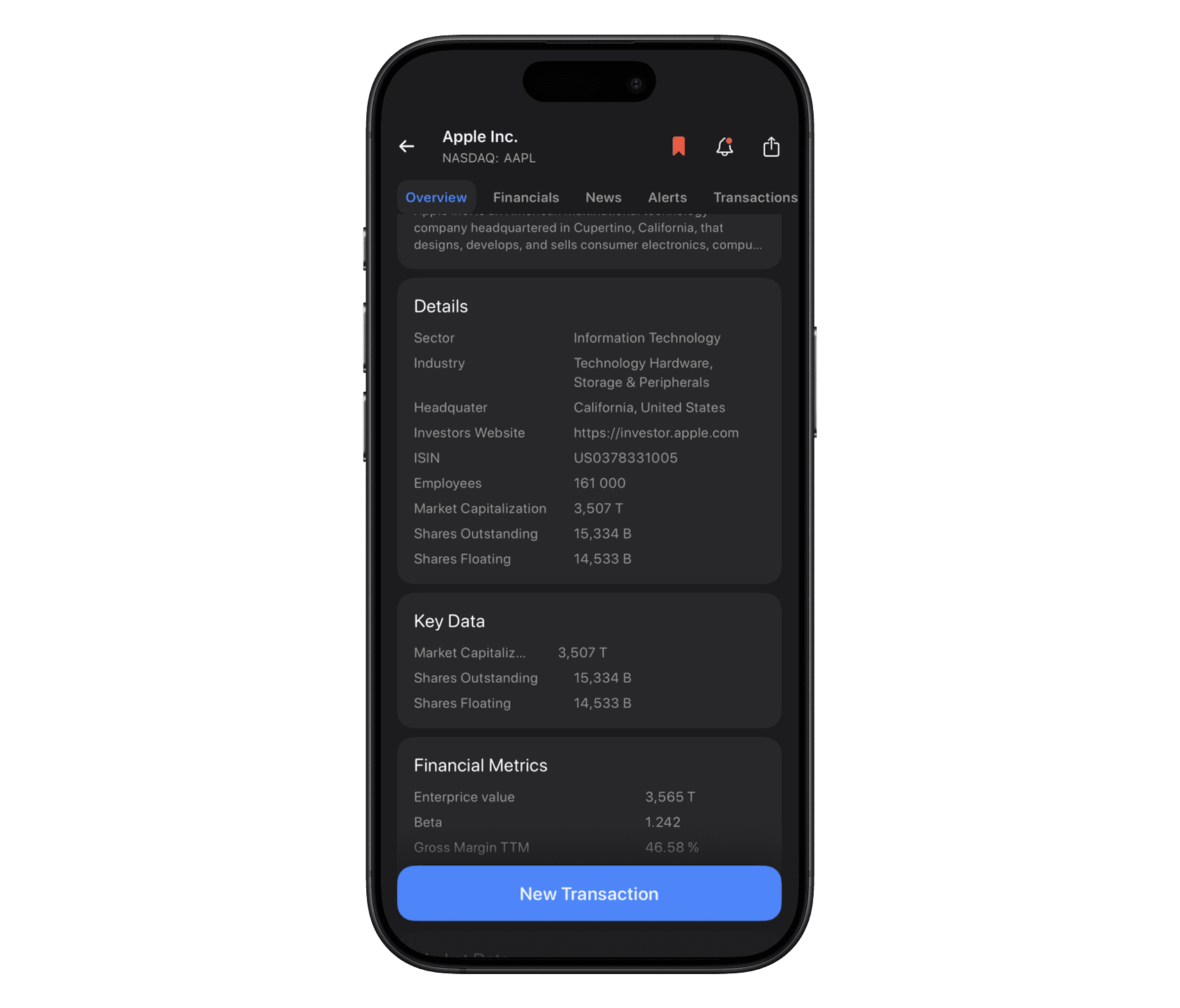
Nearly 100 indicators were available for each company. The initial ambition was maximum data exposure, but surfacing everything created:
overloaded screens
weak hierarchy
decision friction
visual noise
The problem wasn’t missing information — it was decision structure.
architectural decision
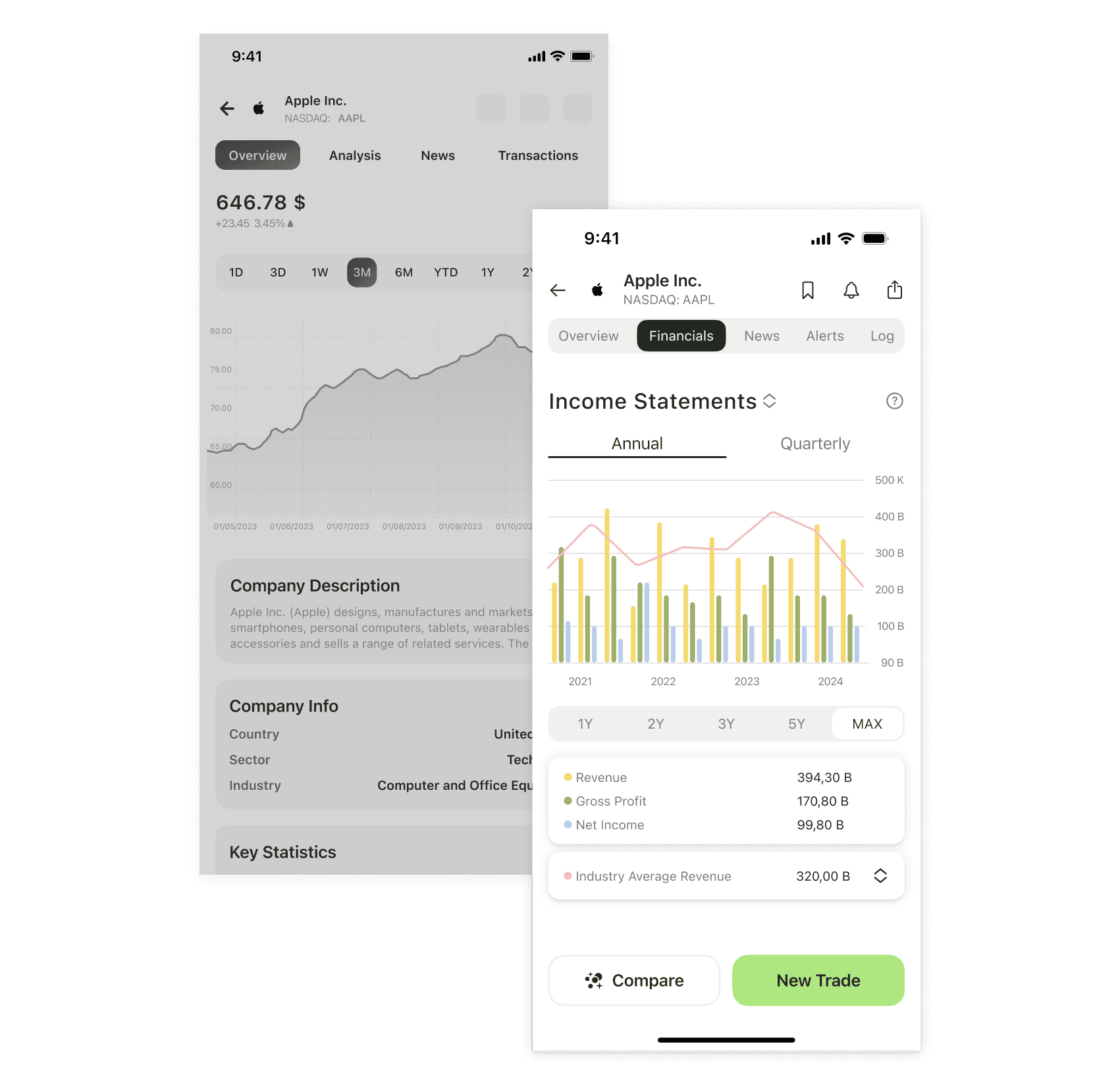
Instead of flattening all indicators into scrollable lists, I introduced a structured financial model:
3 financial groups
3 key metrics per group
3 primary visualizations
This reduced visible indicators from ~100 to ~9 decision-critical metrics while preserving analytical depth through progressive views.
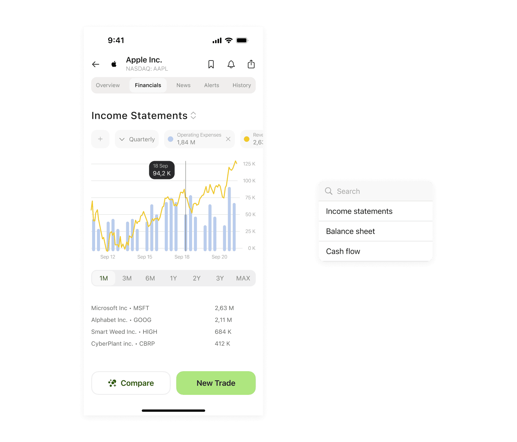
density management
Mobile-first design required balancing:
expert expectations (high data density)
cognitive load
scanability under time pressure
We benchmarked products like TradingView and Yahoo Finance to understand density patterns. Early tests with collapsible sections reduced clutter but introduced friction for experienced traders.
Final decision:
decision-critical metrics remain always visible; secondary indicators surface progressively.

portfolio system refinement
Portfolio cards initially exposed multiple metrics simultaneously, creating scanning fatigue. I replaced metric-heavy cards with:
selector-based interaction
focused metric views
layered information depth
This improved decision clarity without reducing analytical capability.
system complexity
Key architectural considerations:
real-time data updates
derived metric calculation
scalable grouping logic
consistent metric hierarchy across companies
The dashboard structure was designed to scale beyond the initial indicator set.

my role
I led:
• dashboard information architecture
• metric prioritization framework
• grouping logic
• navigation structure
• density reduction strategy
The client defined available data scope and validated financial assumptions.
outcome
structured, scalable dashboard system
reduced visible indicators from ~100 to ~9
clear financial hierarchy
mobile-first decision clarity
testflight launch with early users
The architecture enabled expansion without reintroducing cognitive overload.
reflection
Designing decision environments without validated usage requires disciplined prioritization and structural thinking. This project reinforced the importance of defining decision-critical surfaces first — and exposing complexity progressively.