About
PlantPal simplifies plant care for both beginners and experts with its photo recognition, large plant database, and vibrant community. The AI chat provides quick help, while customizable schedules and easy plant profile setup ensure the best care. It's a fun and efficient way to nurture your plants!
New version 🌱
As a product designer, I was involved in the redesign of the PlantPal Care: Companion app, focusing on improving user experience and functionality.
●⠀New users master the app's functionality 30% faster.
●⠀Improved navigation flow, reducing the number of steps to access key features.
●⠀Added 5 features to improve the app's functionality.
●⠀Enhanced plant identification accuracy by refining the algorithm and expanding the plant database.
●⠀Updated the UI and enhanced the app's individuality by refining the branding.
●⠀According to tests, the update increased user satisfaction by 55%.
Problem 🚧
❝ The PlantPal app, initially an MVP with basic design, was redesigned due to user-reported issues like confusing navigation and limited features.❞
● Limited User Engagement: The app lacked interactive features, leading to low user retention.
● Inadequate Plant Database: Users reported a 35% dissatisfaction rate due to the small plant library and manual addition process.
● Poor User Interface: The user interface was not intuitive, as highlighted by numerous user reviews pointing out difficulties in navigation and usability.
● Technical Issues: Frequent synchronization problems led to a 25% user complaint rate.
User feedback 💭
User reviews for the app were sourced from the App Store and detailed the main issues users faced.
Limitations:
“Seriously lacking reminders for watering and taking care of the plants. Sometimes I forget what needs to be done, and that’s it.”
“Syncing between devices doesn't work at all. Can't access my data on another phone, so annoying!”
UX:
“This 'sites' feature is just awful, I don’t understand how to use it. Developers, please fix this!”
“The interface is too confusing. By the time you figure out how to add a new plant, you lose all desire.”
“The app's not bad, but the plant library is just pathetic. I always have to manually add my own plants, and it's freaking tiring.”
Algorithms:
“The watering algorithms are a total letdown. My plants are either too dry or overwatered.”
⸺⸺⸺⸺⸺⸺⸺⸺⸺⸺
Redesign goals 🎯
● Enhance the way users interact with the app.
● Add new features and functionalities that users need.
● Address issues with inaccurate app algorithms.
● Develop branding and update the UI.
⸺⸺⸺⸺⸺⸺⸺⸺⸺⸺
Improvements 🌼
At the start, I explored the existing app's user scenarios to pinpoint where to begin improvements. This approach led me to focus first on the main screens and gradually enhance the overall visual design.
Main screen redesign
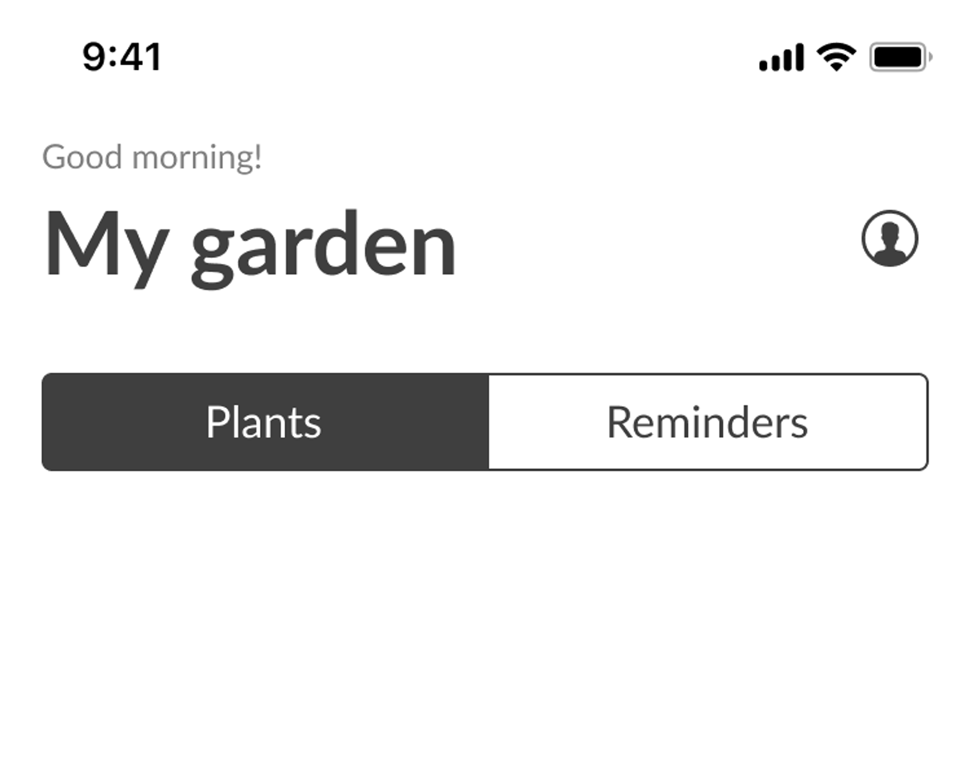
To keep the interface clean, I implemented a tabbed layout using an underline instead of buttons. Initially, the underline was too small, so I extended it across the full tab width for better visibility, maintaining a minimalist look.
Initial tab design
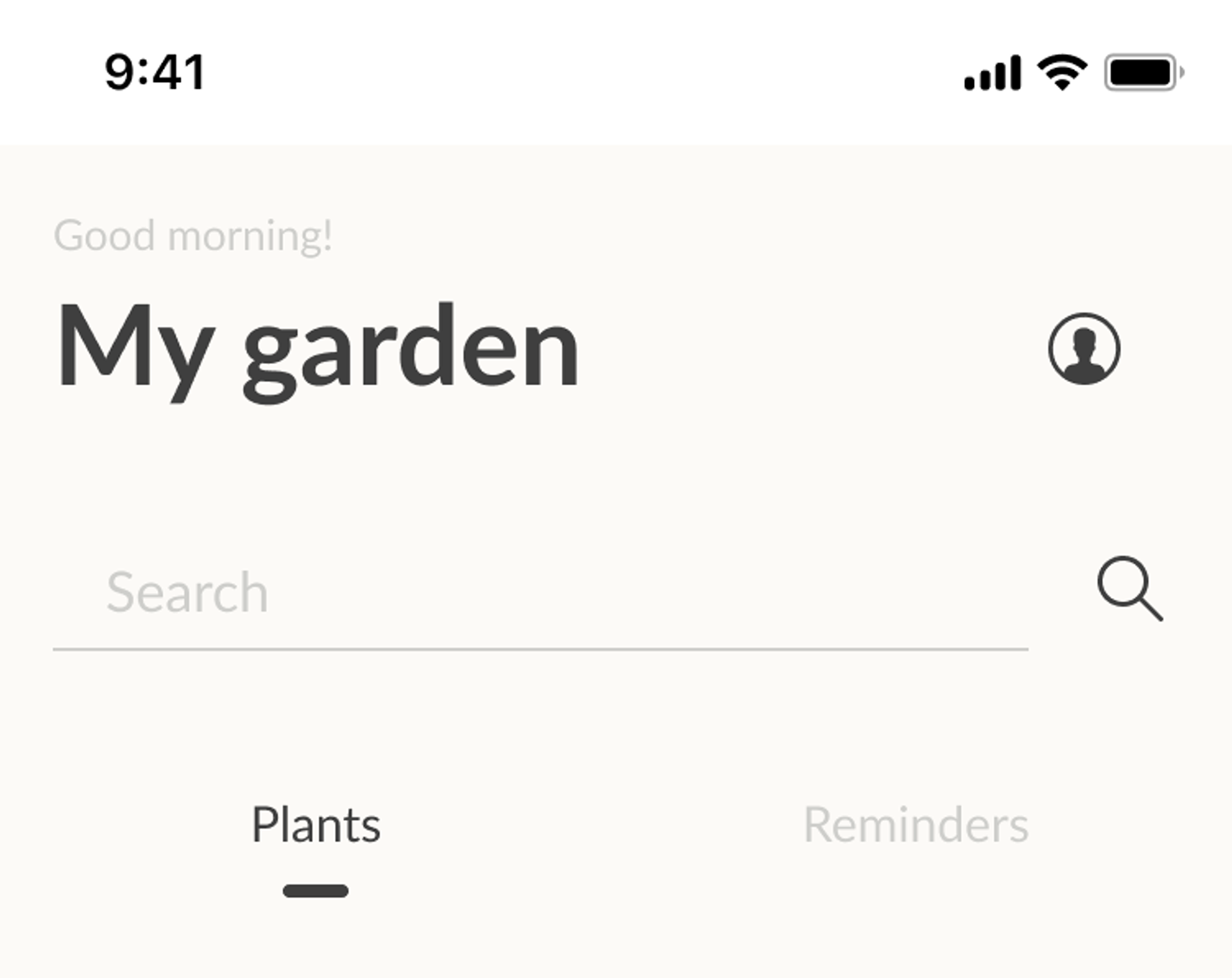
Simplified tab design
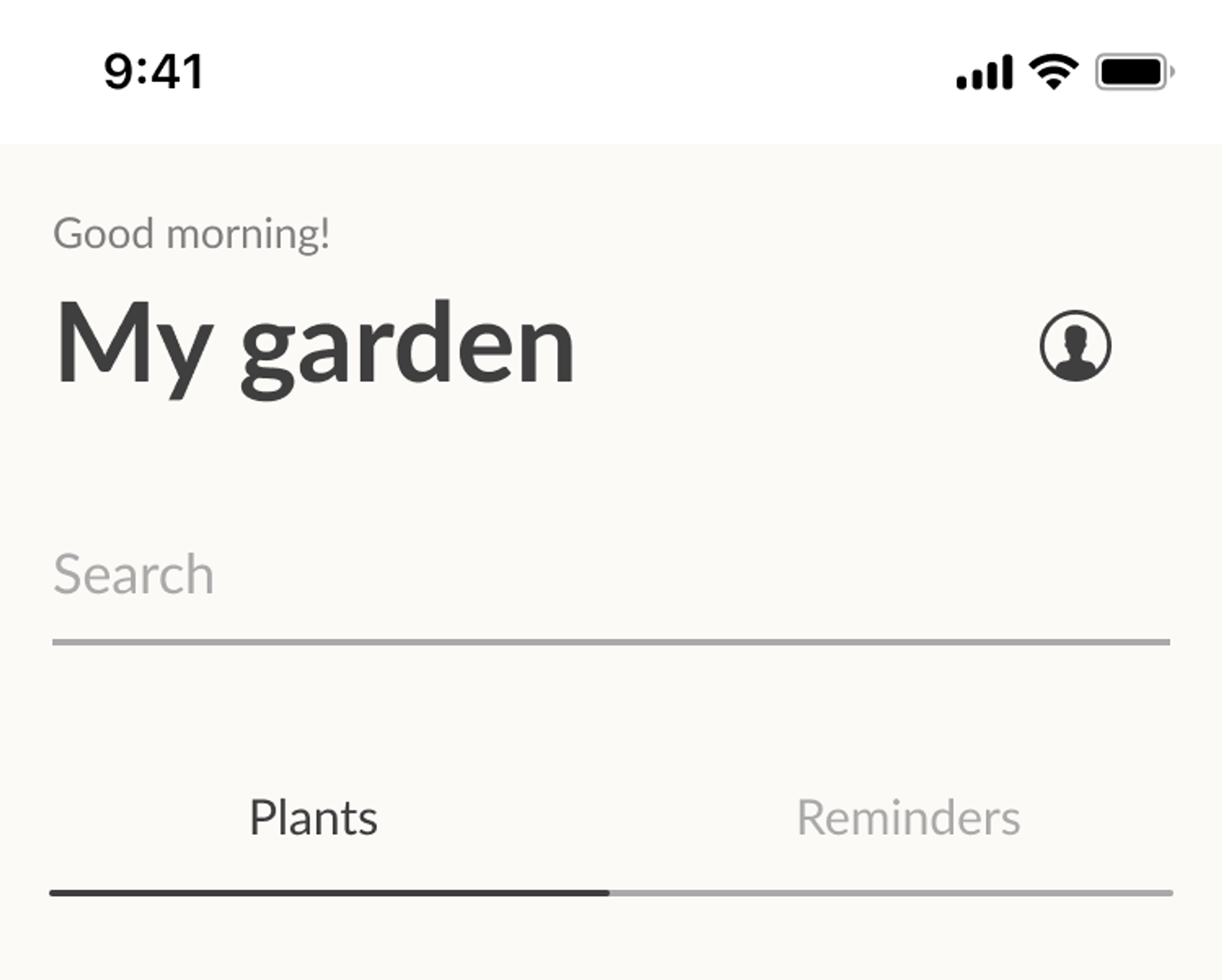
Final tab design
The main screen of the app that greets the user required significant work because the original screen lacked a welcoming vibe. In its empty state, there were no helpful tips or suggestions.
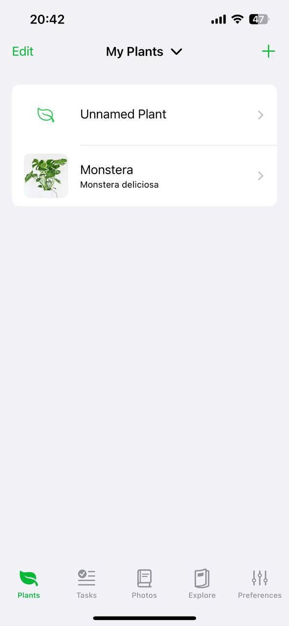
Old version of main screen
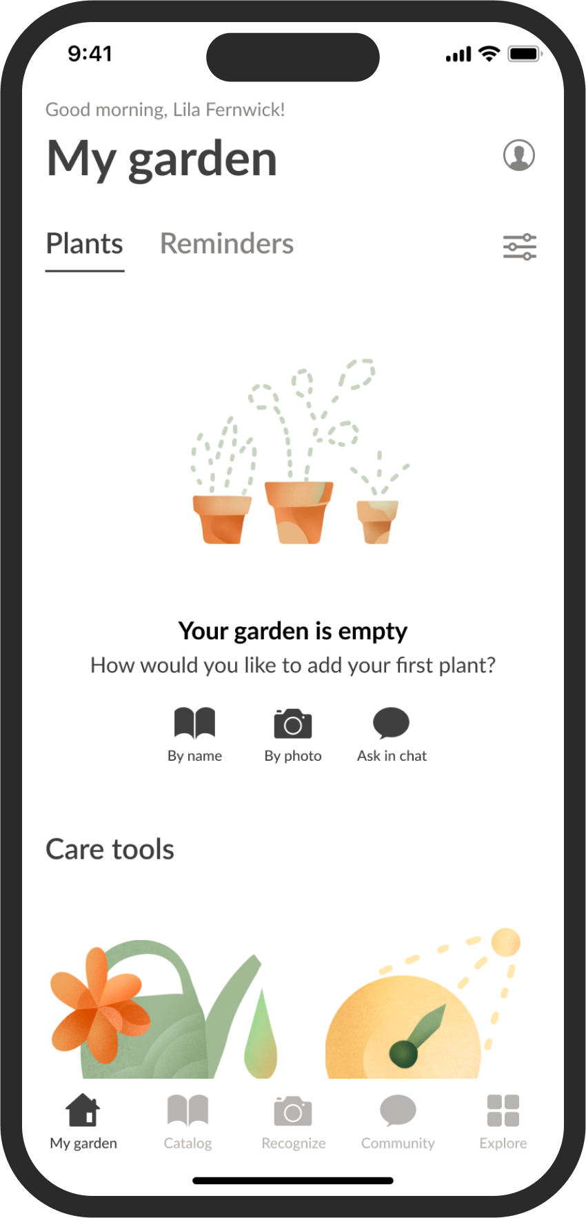
Redisigned main screen. Filled with plants
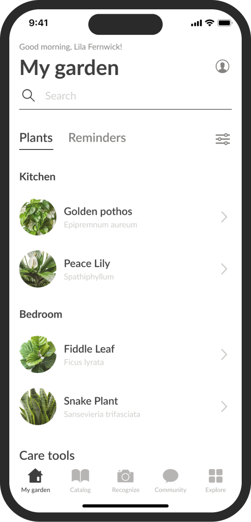
Redisigned main screen. Empty state
✅ In redesigned version:
● I changed the concept by introducing "My Garden" as the new main screen for plant displays, adding a personal touch. I also included a greeting in the header.
● Users can view their plants and access helpful tools for plant care.
● To organize the features efficiently, I created tabs.
● Notifications for garden tasks are immediately visible, eliminating the need to open each plant’s card.
This way, all the main features are easily accessible. The interface looks light and friendly, which will attract users.
Plant card redesign
The original plant card looked cluttered with no clear visual hierarchy, which was frustrating for users who wanted immediate plant information.
This redesign focuses all the info around the plant itself, giving users a complete picture and making it easier to manage their plants.
✅ In the updated version:
● The plant card now highlights key info first.
●⠀Multiple photos are included to showcase the plant.
● Control buttons are moved to a separate tab for easy access.
● The main action is prominently displayed and highlighted.
Manual plant addition
The layout allows users to stay focused on plant data without distractions.
✅ What’s new:
● When adding a plant manually, the form has been updated.
● You can now easily upload a photo and add a description right away.
● Extra fields are visible and can be filled in if you have more details.
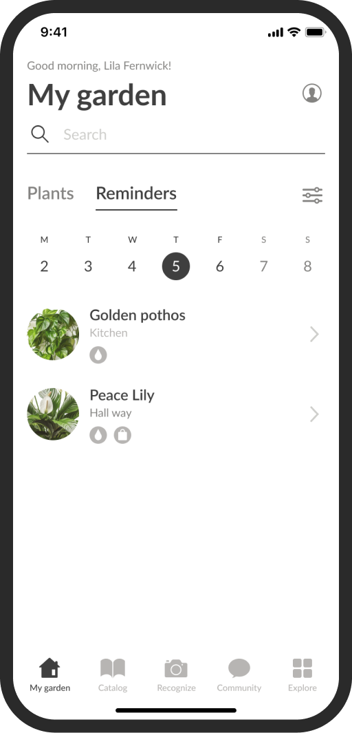
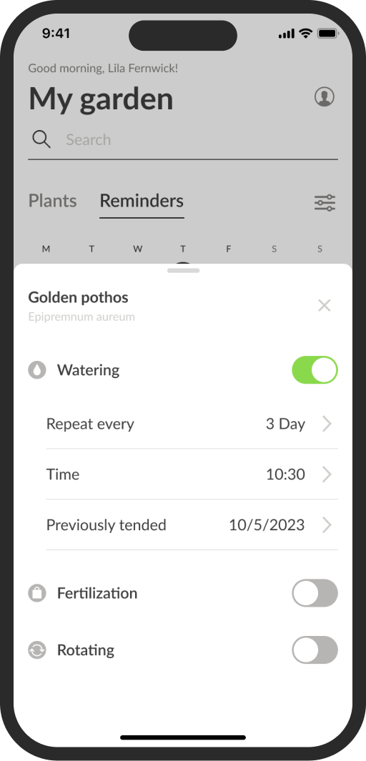
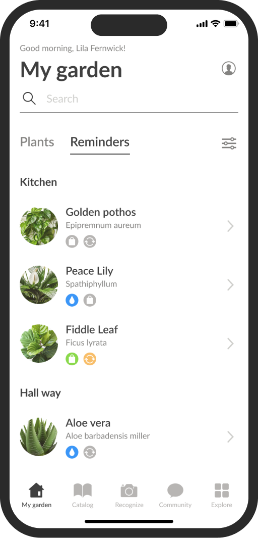
Enhanced notifications and reminders
By letting users create custom reminders, the app not only enhances user satisfaction with a personalized experience but also encourages frequent engagement, which can boost retention rates.
✅ New version provides:
● Notifications are now accessible from the main screen.
● The new version features a line-style calendar that can be hidden.
● Scrolling through the calendar lets you see care tasks for each day.
● Customizable reminders allow personalized plant care.
Branding & Interface update (UI)
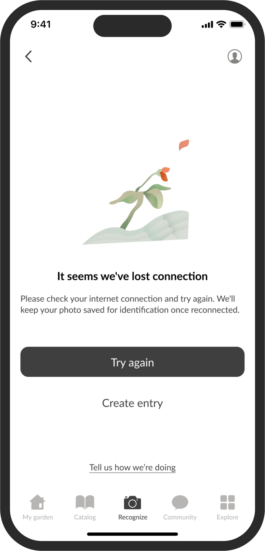
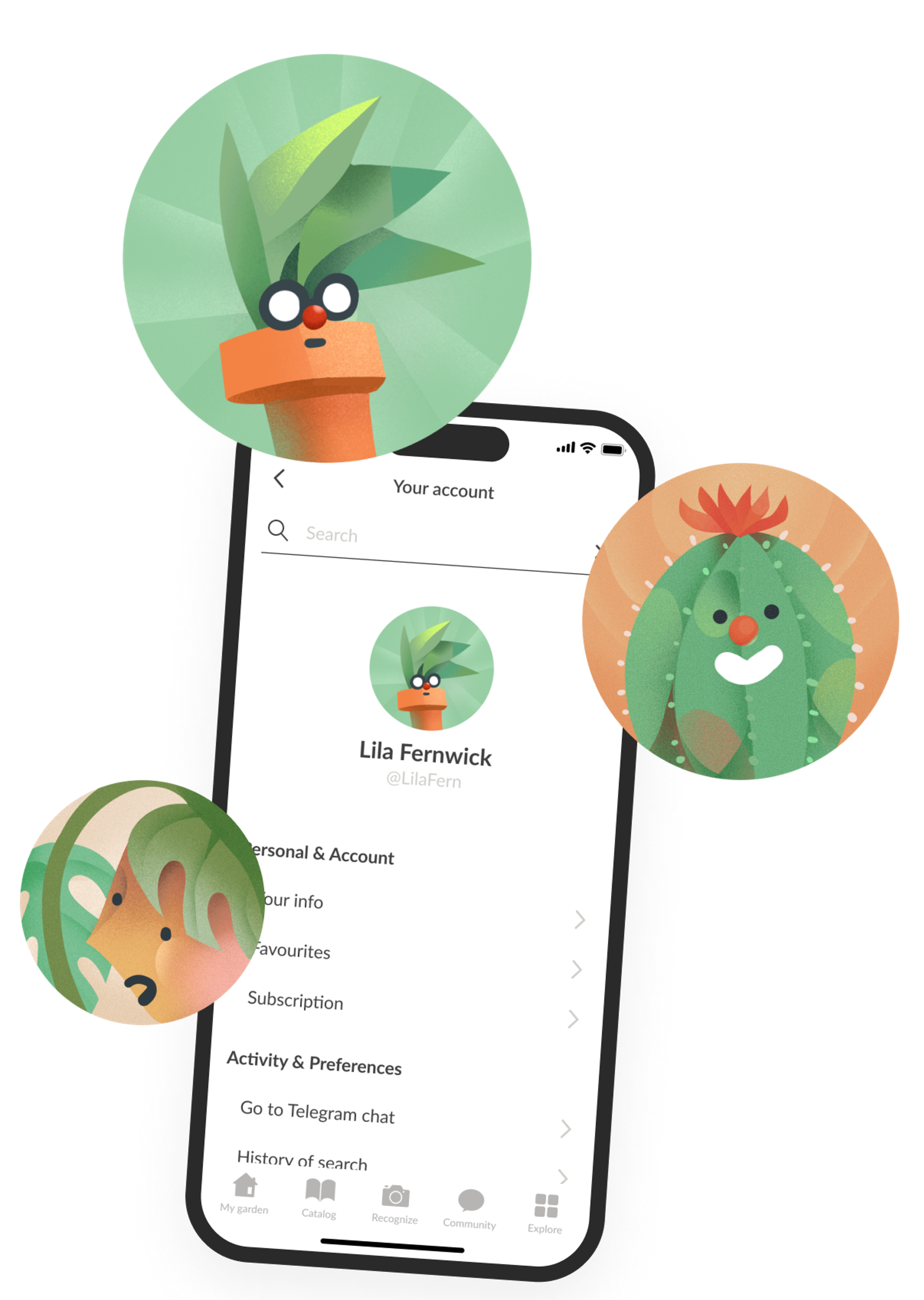
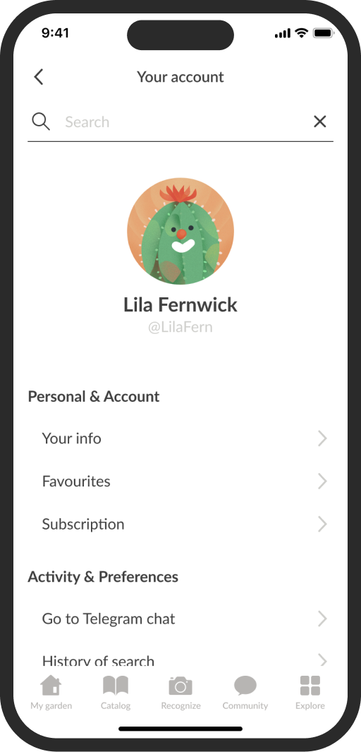
The app now has a refreshed, natural-style interface that's more visually appealing and easier to navigate.
I art-directed the creation of illustrations for the app, working closely with illustrator to achieve the desired visual style.
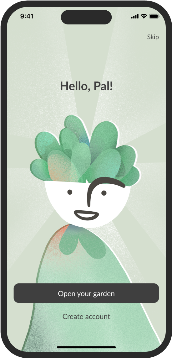
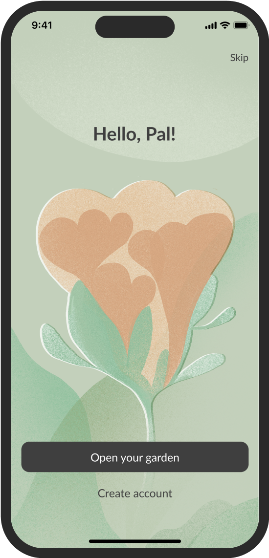
Added friendly illustrations for empty states, helping users adapt.

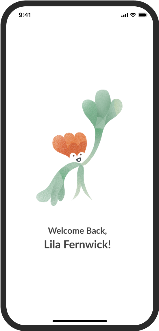
Added a set of illustrated avatars.
Features 💡
Welcome Screen
When the app opens, users see a welcoming screen.
Adding welcome screens boosts brand recall and brings more emotion and engagement to the app. I tested this with users, and they really enjoyed this new feature compared to when it was absent.
Plant Identification 🌸
To make plant identification easier, I developed a system that helps users recognize houseplants efficiently.
● The plant database has been expanded compared to the old version.
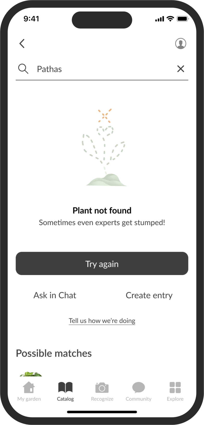
● Plants can be added through catalog search, and if nothing matches, users can try other methods.
● Photo recognition has been added for quick ID.
● If the search and photo recognition don't work, users can turn to the community.
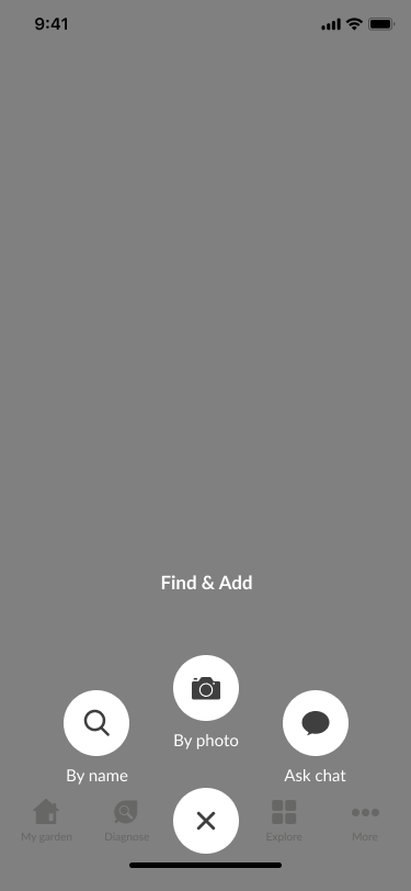
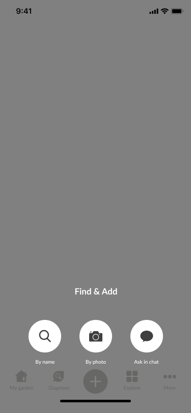
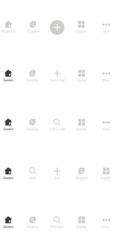
I tried various button placements for these features. Based on feedback, I made photo recognition the main feature, with search and community functions on their screens, avoiding dropdown menus to reduce taps.
Addressed complaints about a small plant database and difficult plant addition. The redesign simplifies the process, allowing users to skip some fields and fill them later, such as after community consultation. This helps create plant cards and set notifications without extra steps.
Enhanced plant identification with three features: photo ID, catalog search, and community/AI chat support. These interconnected functions ensure successful plant identification and proper care strategies.
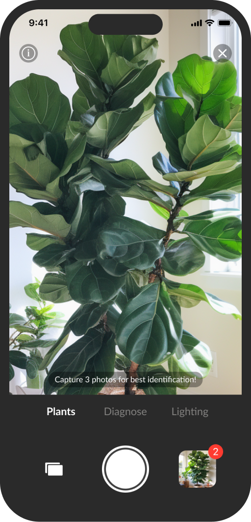
Photo Identification 📷
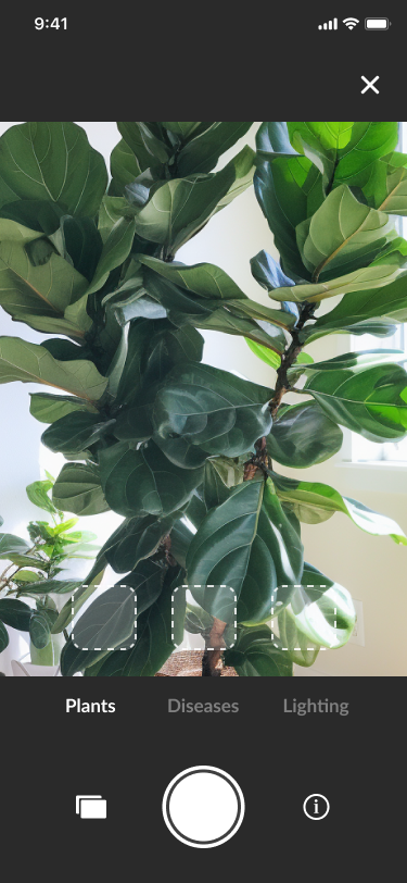
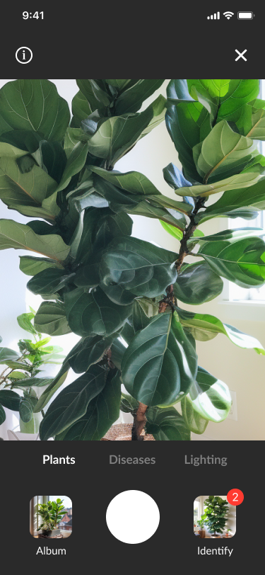
For plant identification via photos, multiple photos were needed for accuracy. Initially, small frames were used to show progress, but they took up too much space. Instead, I added a photo count label on the icon and a small tooltip for instructions.
Community 🗨️
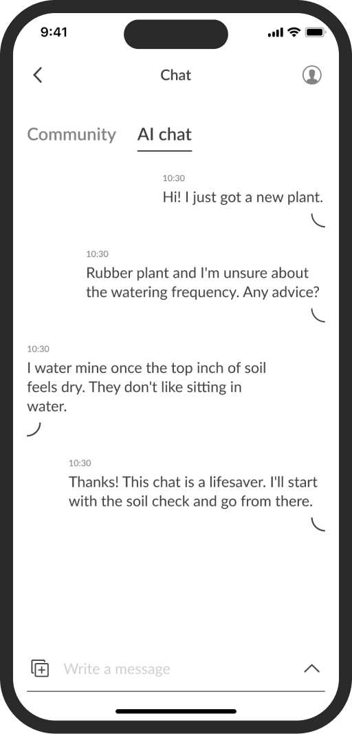
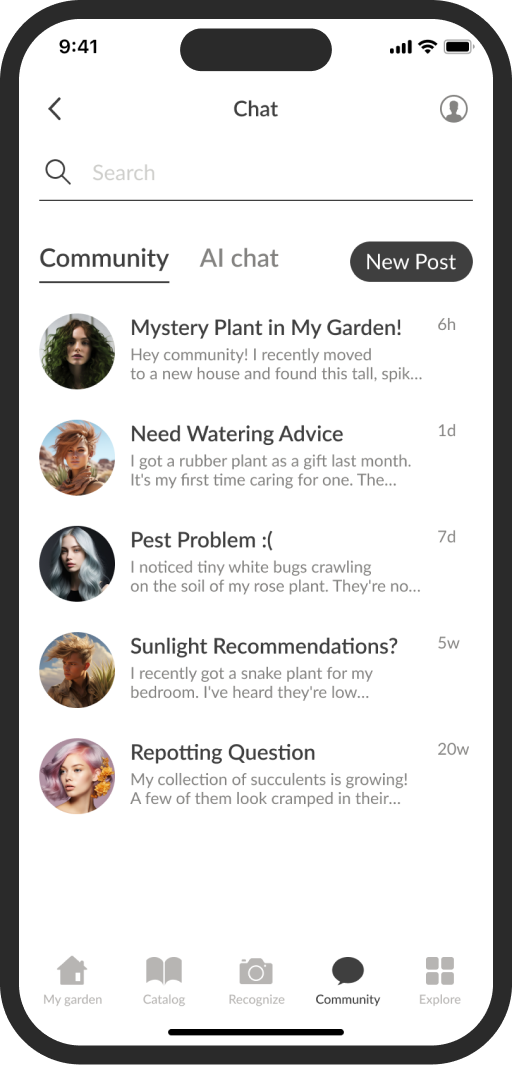
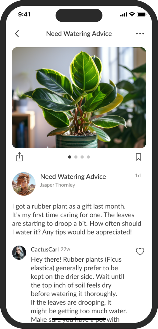
● The new community feature lets users interact, share tips, and learn about plants, boosting engagement and ease of learning.
● Establishing a community platform fosters user engagement and promotes organic growth through user-generated content and word-of-mouth, increasing the app’s visibility and attractiveness.
AI Chat 🤖
● Added an AI chat feature, as it's popular and helps users get quick info without much technical investment.
● Provides instant support, enhancing customer interaction and satisfaction. It's cost-effective and straightforward, potentially boosting user retention and attracting new users seeking a supportive environment.
Together, these features significantly enhance user experience and engagement.
Prototypes Tested ⚗️
Prototypes have been tested with users, and the feedback has been great! Users are happy with the improvements and find the new features much more user-friendly. These designs are now in development, and the updated app will be available soon.
Personal Insights ✨
During this project, I achieved a lot.
● Analyzed user feedback to guide new strategies for future improvements.
● Explored trending features like AI chat and community platforms.
● Focused on how these features enhance user engagement and experience.
● Focused on creating a cohesive brand experience throughout the app.
Future Development 🛠️
Looking ahead, I plan to add several exciting features to further enhance the app:
1. Advanced Plant Care Tips: Personalized advice based on specific plant needs and user environment.
2. Smart Home Integration: Connect with smart devices for automated watering and lighting adjustments.
3. Expanded Social Features: More interactive elements within the community platform, such as plant care challenges and achievements.
Other projects
