Valuest
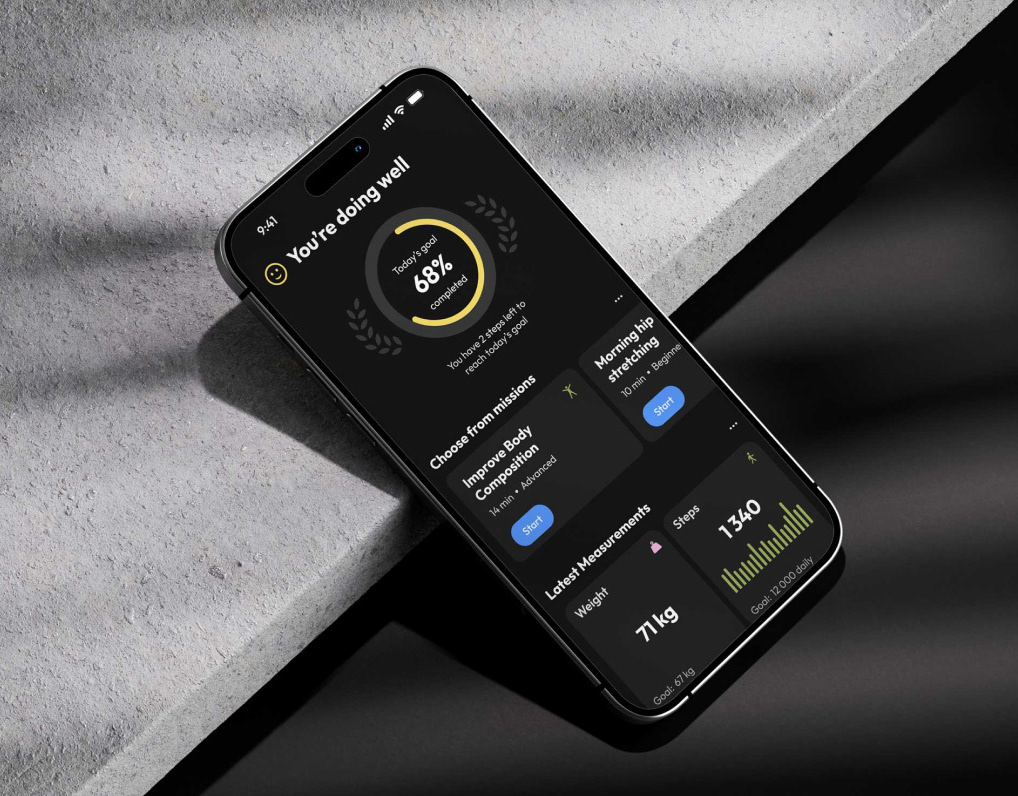
This app simplifies investing and makes it accessible for everyone, from beginners to seasoned pros. It helps track investments, deliver clear insights, and support smarter decisions — all in one place. With tools like real-time updates, intuitive visuals, and smart notifications, the app is built to grow alongside user needs, with plans for advanced analytics and community features.
❝ Simplifying investing with clear insights and smarter decisions — all in one place. ❞
⠀
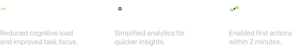
Key results
⠀
My role: Sole designer
I led the design process from start to finish, ensuring alignment with the team and maintaining efficiency throughout. My key responsibilities included:
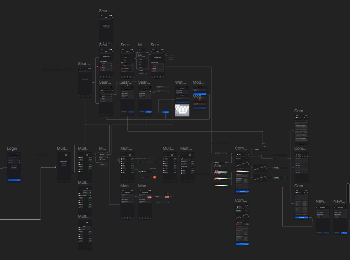
Analysis → Audience Research → Wireframing → UI Design → Component Design → Application Architecture
⠀
Problem
Problem statement
Making investment decisions requires users to access a small amount of key information.
However:
● Complex interfaces and information overload create challenges for both beginners and professionals.
● Many competitors lack tools to analyze a company's context, such as its market position and competitors.
Why this is a significant problem
● Risk of financial loss: Inefficient tools make it harder to make informed decisions, potentially leading to poor outcomes.
● Need for speed: Market conditions change rapidly, and delays in accessing crucial data can impact decision-making.
● Low engagement: Beginners often abandon investing due to complicated and unintuitive interfaces, limiting audience growth.
⠀
Research
Hypotheses
● A simplified interface will help users make decisions faster.
● Clear data hierarchy will speed up access to key information.
● Reducing visual clutter will improve focus on tasks.
Competitive Analysis
I analyzed the interfaces of five competitors and identified the following issues:
● Information overload.
● Lack of in-depth data analysis for companies.
● Complicated workflows for completing operations.
⠀
Idea Development
The core goal of the application is facilitating transactions, which requires simplifying key user flows, such as "choosing a company to invest in" and "managing a portfolio."
Through research, I identified and prioritized:
● Primary Scenarios: Adding transactions, tracking portfolio performance, and viewing key company data
● Secondary Scenarios: Exploring competitor comparisons, managing watchlists, and accessing detailed analytics

Concepts and Prototypes
1. The initial client mockups were revised to address missing functionality, such as portfolio management tools and transaction shortcuts, and to ensure consistency across design elements.
2. Core screens were developed iteratively, with features grouped logically and continuously refined to create a synchronized and cohesive structure.
3. Prototypes focused on simplifying user scenarios by reducing the number of steps by 30% and streamlining the interface for a more intuitive user experience.
4. Feedback loops with stakeholders ensured that design iterations aligned with user needs and business goals.
⠀
Prototype Testing
Prototypes were distributed via TestFlight for testing by real users, allowing us to gather actionable feedback on functionality and design.
Key Insights from Testing:
● 25% Time to Task Completion: Streamlined user flows significantly reduced the time needed for key actions.
● Enhanced Decision-Making: Clear data visualization and hierarchy were highlighted as major strengths by testers.
● Identified Improvements: Navigation inconsistencies and minor interface elements were adjusted based on feedback.
This testing process validated key scenarios and helped fine-tune the app's features, providing a strong base for further development.


⠀
Final Solution Selection
The final solution addresses the MVP's immediate needs while remaining adaptable for future enhancements.
Modular Visual Hierarchy:
1. System: By combining backgrounded and non-backgrounded blocks, we achieved a scalable design that organizes information logically and efficiently.
2. Enhanced User Focus: Backgrounded blocks highlight key data, helping users focus on what matters most.
3. Flexibility for Growth: This modular system allows for the seamless addition of new features, such as advanced analytics or community tools, without compromising the interface's simplicity.
⠀
Design system
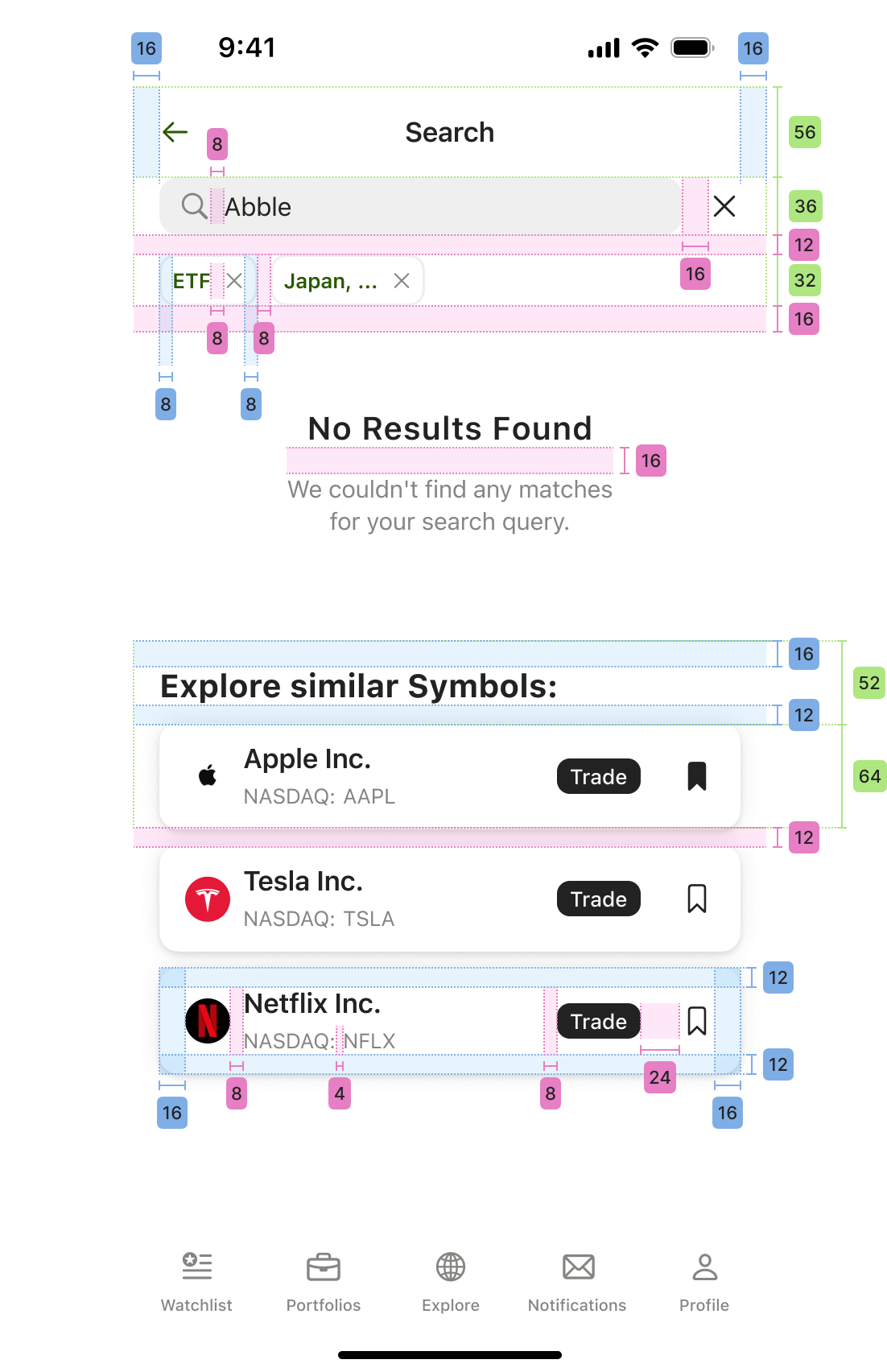
To ensure a cohesive and scalable design, I implemented a structured design system with the following key principles:
● Base Unit and Grid: A core unit of 2px and a grid system built around 4px provided flexibility for responsive layouts and a harmonious visual structure.
● Consistency Across Elements: Spacing, typography, and iconography adhered to the same system, creating a seamless and professional appearance.
● User-Focused Hierarchy: Icons and text labels were chosen to enhance clarity and navigation, making tasks intuitive and reducing cognitive load.
● Scalable and Efficient: The design system facilitated rapid iteration and ensured design-developer alignment, improving overall efficiency during implementation.
⠀
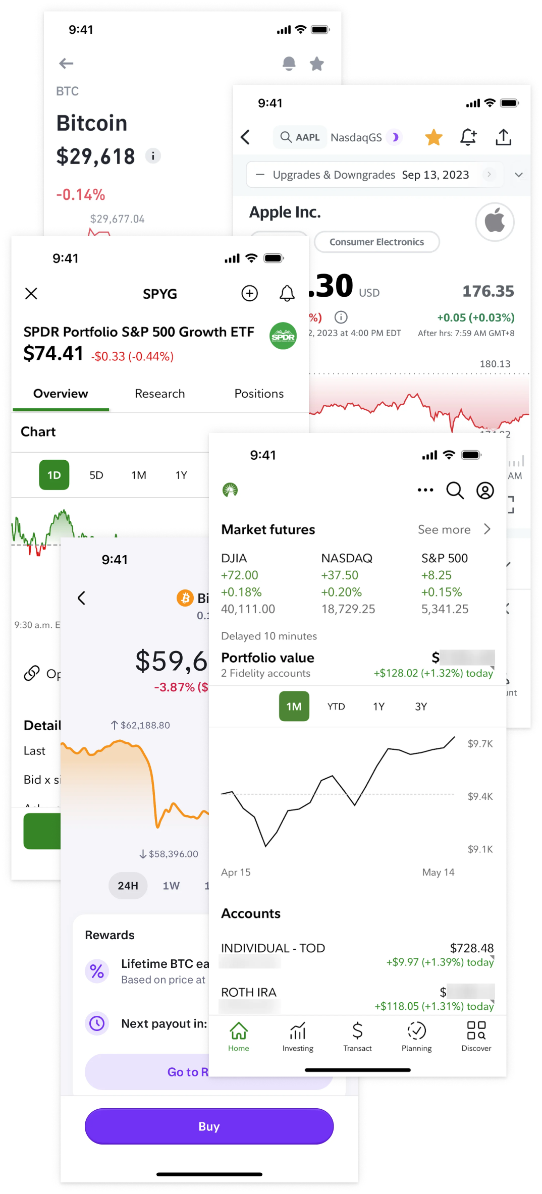
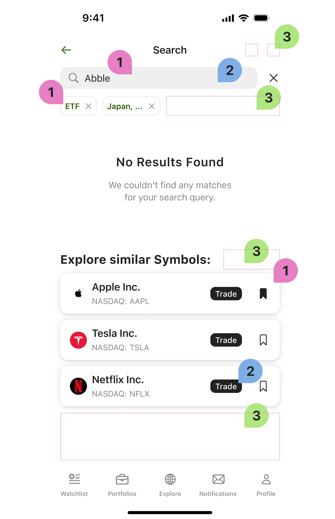
Cool Features
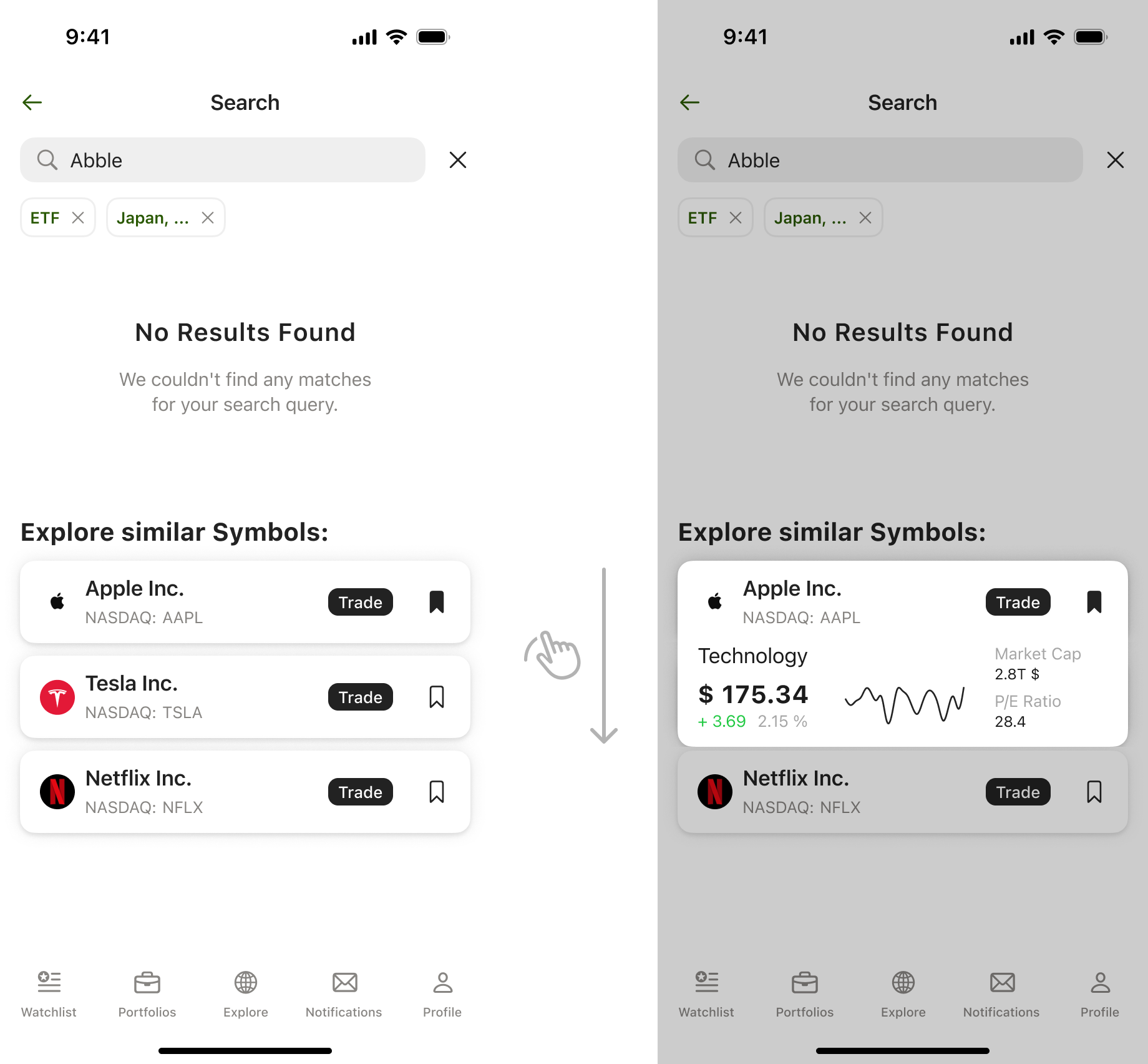
● Smart search:
Provides quick access to company data, enabling users to add companies to watchlists or initiate transactions effortlessly.
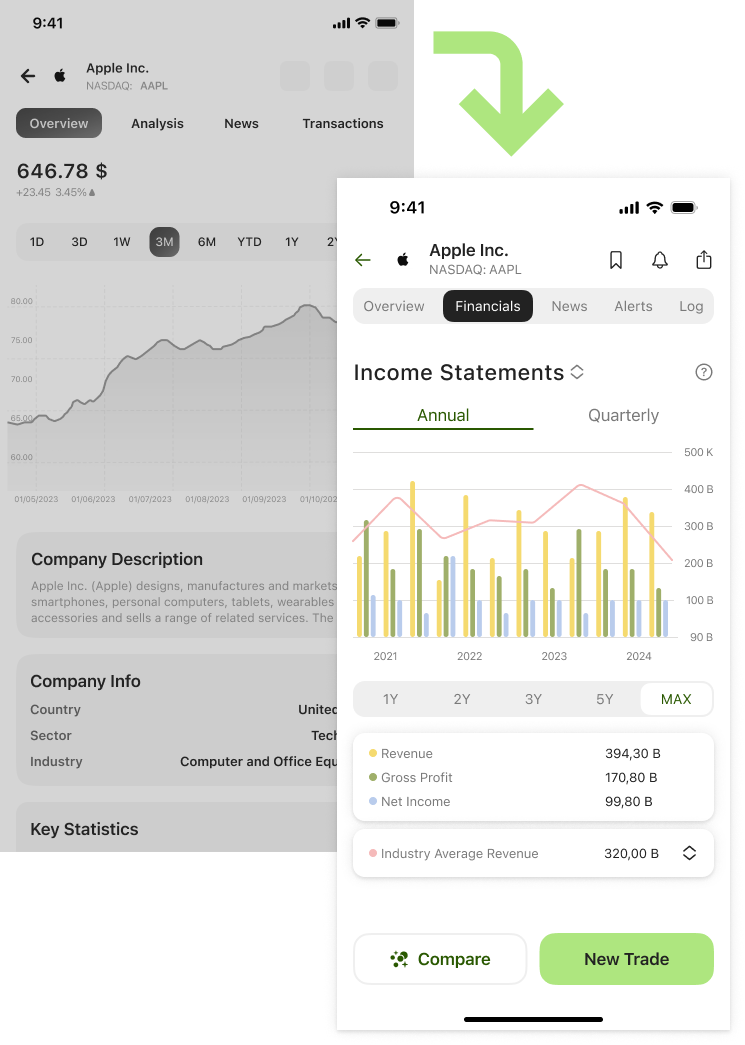
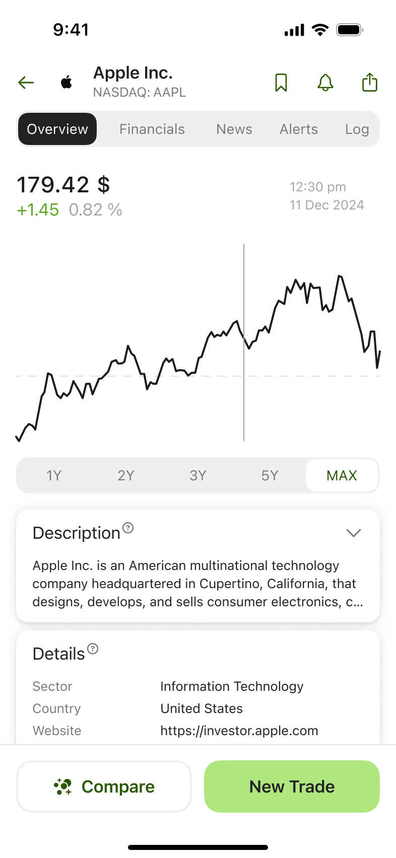
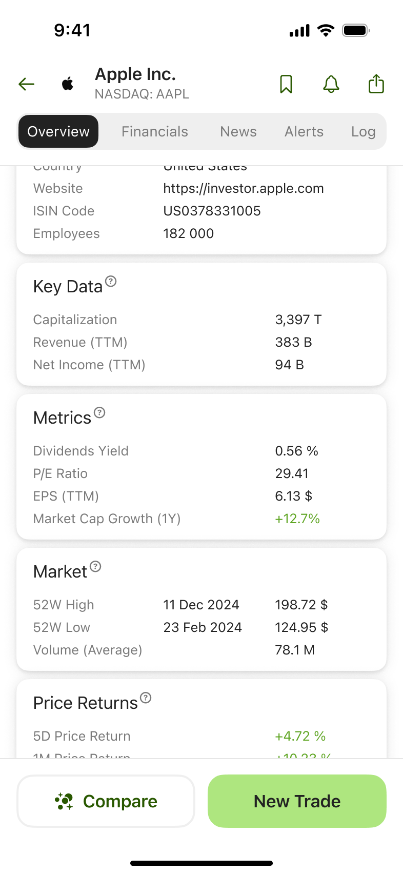
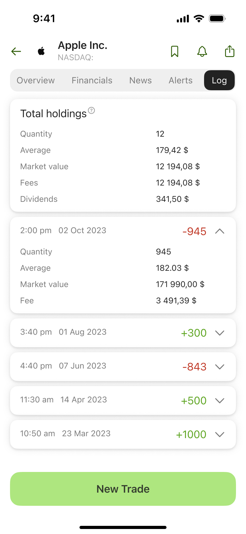
● Comprehensive company details:
Includes dedicated sections for quick overviews, financial performance, news, detailed analytics, and transaction history, offering a complete picture for informed decisions.
● Interactive Interface:
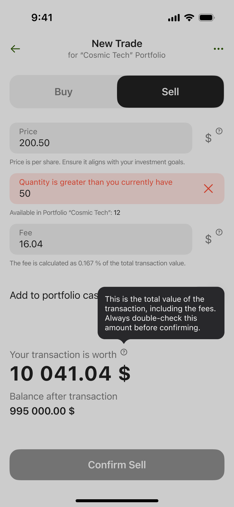
Offers real-time feedback on user actions, such as error notifications, tips, and confirmations, ensuring clarity and smooth navigation.
● Expandable Content Blocks:
Prioritizes key information while presenting additional details in collapsible sections, helping users focus on what's important and explore further when needed.
⠀
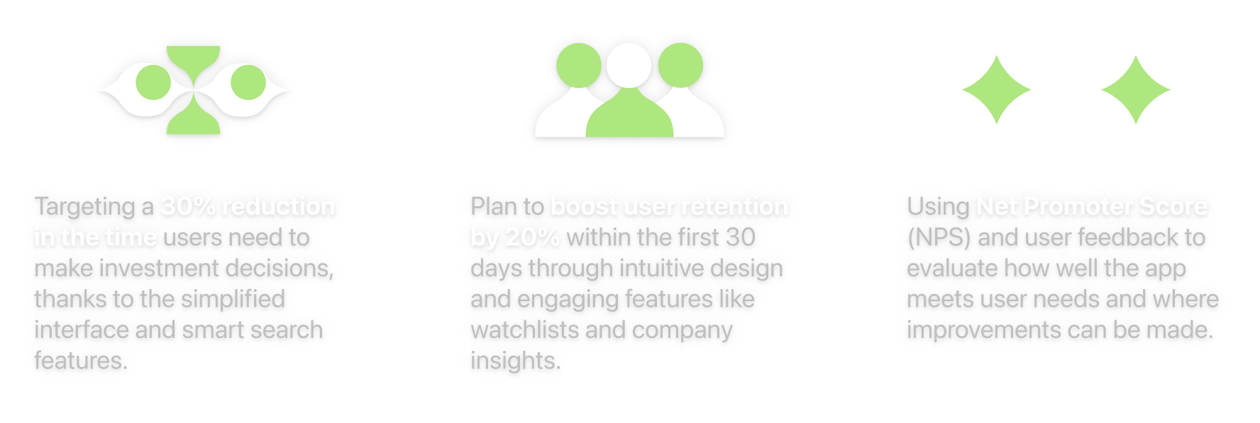
Business Results
While metrics are not yet available for the MVP phase, we have outlined key measurement goals to assess the app’s success:
Personal Takeaways
● Developed the ability to break down complex tasks into smaller, actionable steps, which improved efficiency and adaptability in uncertain situations. For example, simplifying the transaction user flow reduced complexity for end-users.
● Enhanced my skills in designing for complex scenarios by focusing on minimalism and creating user-centric solutions, ensuring clarity and ease of use.
● Leveraged TestFlight to streamline the iterative testing process, gathering valuable user feedback early in development and refining the design to ensure a seamless and intuitive experience.
What Could Have Been Done Differently
● Improved Task Planning:
Incorporating a sprint-based planning system with buffer time for unexpected changes would have allowed the team to adapt more efficiently without impacting the overall timeline.
● Thorough Prototype Testing:
Conducting deeper usability testing on prototypes before development could have uncovered potential issues earlier, reducing the need for adjustments during implementation.
● Lessons Learned: These experiences highlighted the importance of proactive planning and early validation, which I will apply in future projects to ensure smoother workflows and better outcomes.
Future Development
● Add a dark theme for customization and better low-light usability.
● Introduce community features for user interaction and strategy sharing.
● Develop educational materials to support beginners in investing.
● Enhance data visualization for clearer insights and faster decision-making.
● Expand analytics tools to offer deeper portfolio and market performance insights.
Thanks for taking a peek!
Designing this app was as much about reducing clutter as it was about having fun. If you’re still here, let’s team up to make something even cooler next time. Or just talk about how wild this journey was.
Other Projects