Subscription cancellation flow for Resume.io
Resume.io is an online platform that helps users quickly create professional resumes using built-in templates and design tools.
The company noticed that the average duration of a paid subscription is only a few months, after which many users cancel. Interestingly, a significant number of these users return six months later. This presents an opportunity to reduce churn and gather insights on why users decide to unsubscribe in the first place.
⠀
Chasing a 10%+ retention goal
Enhance the unsubscribe process to gain insights into why users cancel their subscriptions (paid or trial) and, retain at least 10% of them at this critical step.
⠀
Was solo UX/UI designer
I worked on improving the subscription cancellation flow by conducting user research, identifying key user cohorts, and designing a more personalized offboarding experience.
● Proposing new page layouts
● Creating targeted email campaigns
● Refining the overall UX
⠀
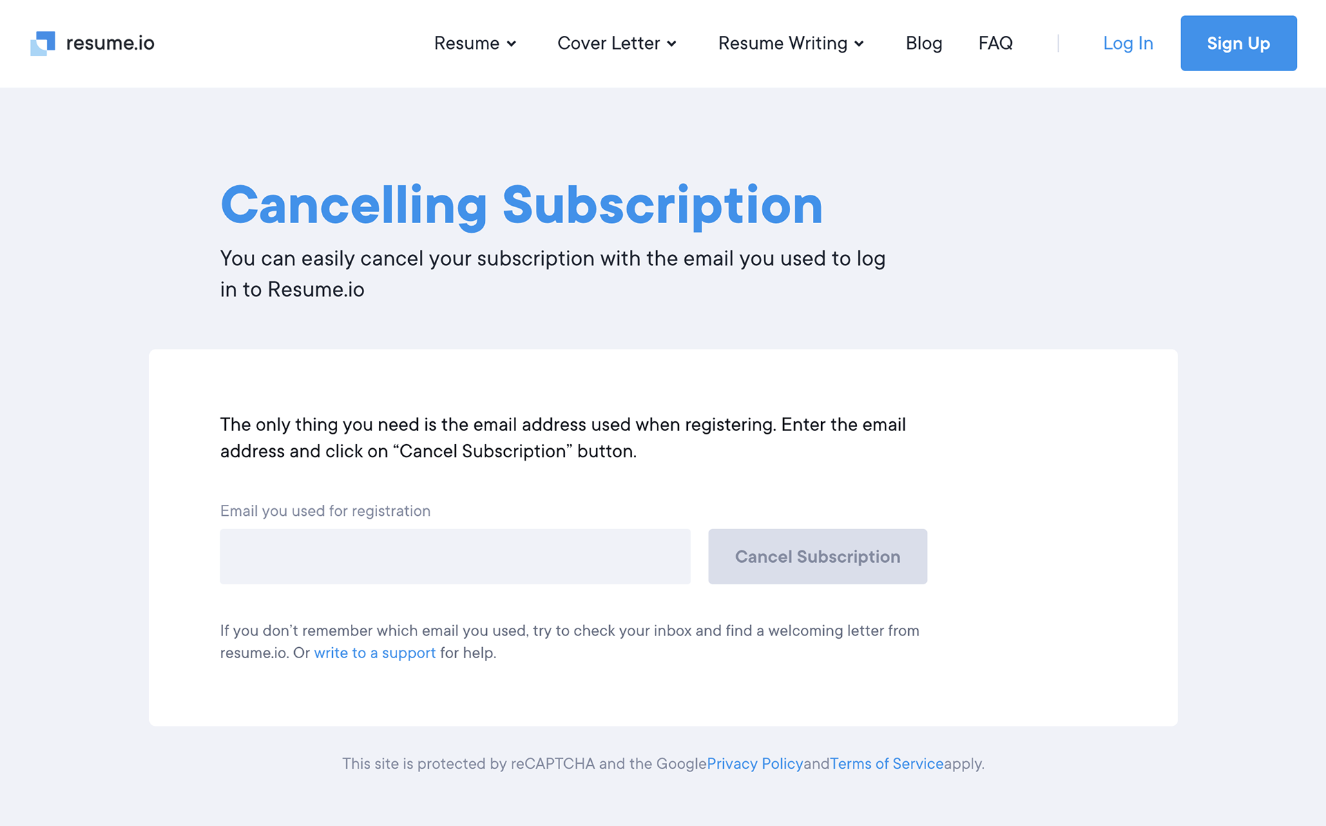
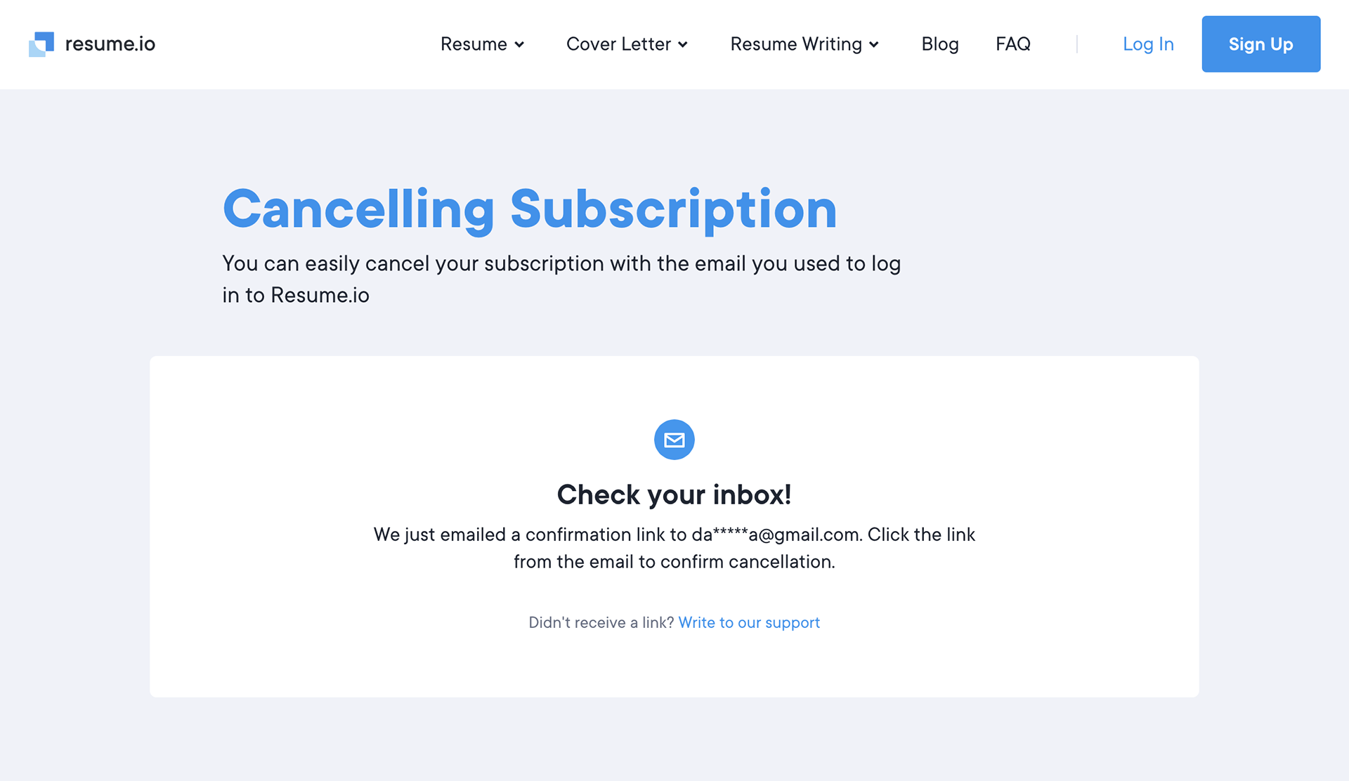
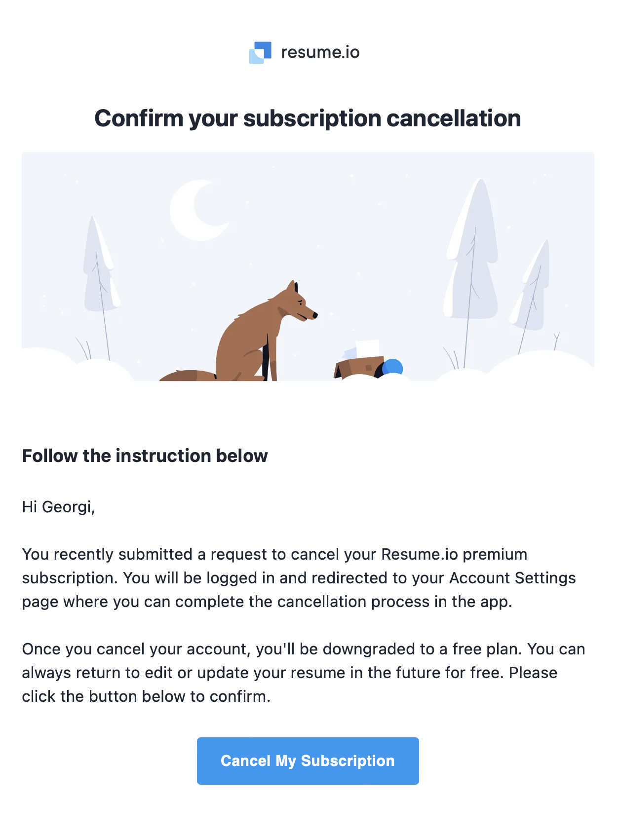
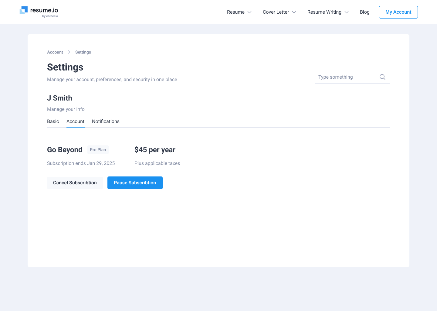
How it works before
1. The user visits the cancel subscription page:
2. An email is sent to confirm cancellation:
3. Clicking the CTA button in the email cancels the subscription:
⠀
Uncovering user behaviors: research approach
Analyze the available data to understand the primary reasons for canceling. To structure the insights, I divided users into cohorts based on their subscription length and usage patterns.
⠀
Core hypotheses for reducing churn
● Some users find the cost too high given their current needs
● Some users only need a short-term solution for building their resume and then no longer require the service
● Technical or UX friction might be causing frustration and driving cancellations
● Users may be unaware of advanced features or benefits that come with a continued subscription
⠀
Segmentation & research methods in action
User metrics analysis:
● Number of sessions, session duration, depth of page views
● Frequency and extent of resume editing
● Number of created resumes and used templates
● Frequency and extent of resume editing
● Number of created resumes and used templates
Unsubscription / Feedback forms:
● Collect reasons for leaving through a form when canceling a subscription
● Analyze open-ended user responses or offer a list of possible reasons for cancelation
● Analyze open-ended user responses or offer a list of possible reasons for cancelation
Support interactions:
● Frequency of support requests, types of queries
● Whether users asked for discounts, refunds, or extensions of the trial period
● Whether users asked for discounts, refunds, or extensions of the trial period
Subscription and cancellation history:
● How many times a user has subscribed and unsubscribed
● How much time passed between subscription and unsubscription
● How much time passed between subscription and unsubscription
Based on the research analysis, I identified four main cohorts:
1. Indecisive Users with Low Engagement:
● Spend minimal time using the service
● Often cancel their trial subscription early
● Often cancel their trial subscription early
2. Users Who Found a Job and Have Low Engagement:
● Also spend minimal time on the platform
● Indicate “Found a job” as the reason for canceling their subscription
● Indicate “Found a job” as the reason for canceling their subscription
3. Price-Sensitive Users (Budget Constraints):
● Spend an average or slightly above-average amount of time on the site
● Explore the core functionality but do not dive in deeply
● Frequently revisit pricing pages and payment FAQs, likely seeking discounts or more affordable plans
● Explore the core functionality but do not dive in deeply
● Frequently revisit pricing pages and payment FAQs, likely seeking discounts or more affordable plans
4. Users with High Achievements or Progress:
● Have frequent, extended sessions and return to the service regularly
● Tend to renew subscriptions more often than average, reflecting higher overall engagement
● Tend to renew subscriptions more often than average, reflecting higher overall engagement
⠀
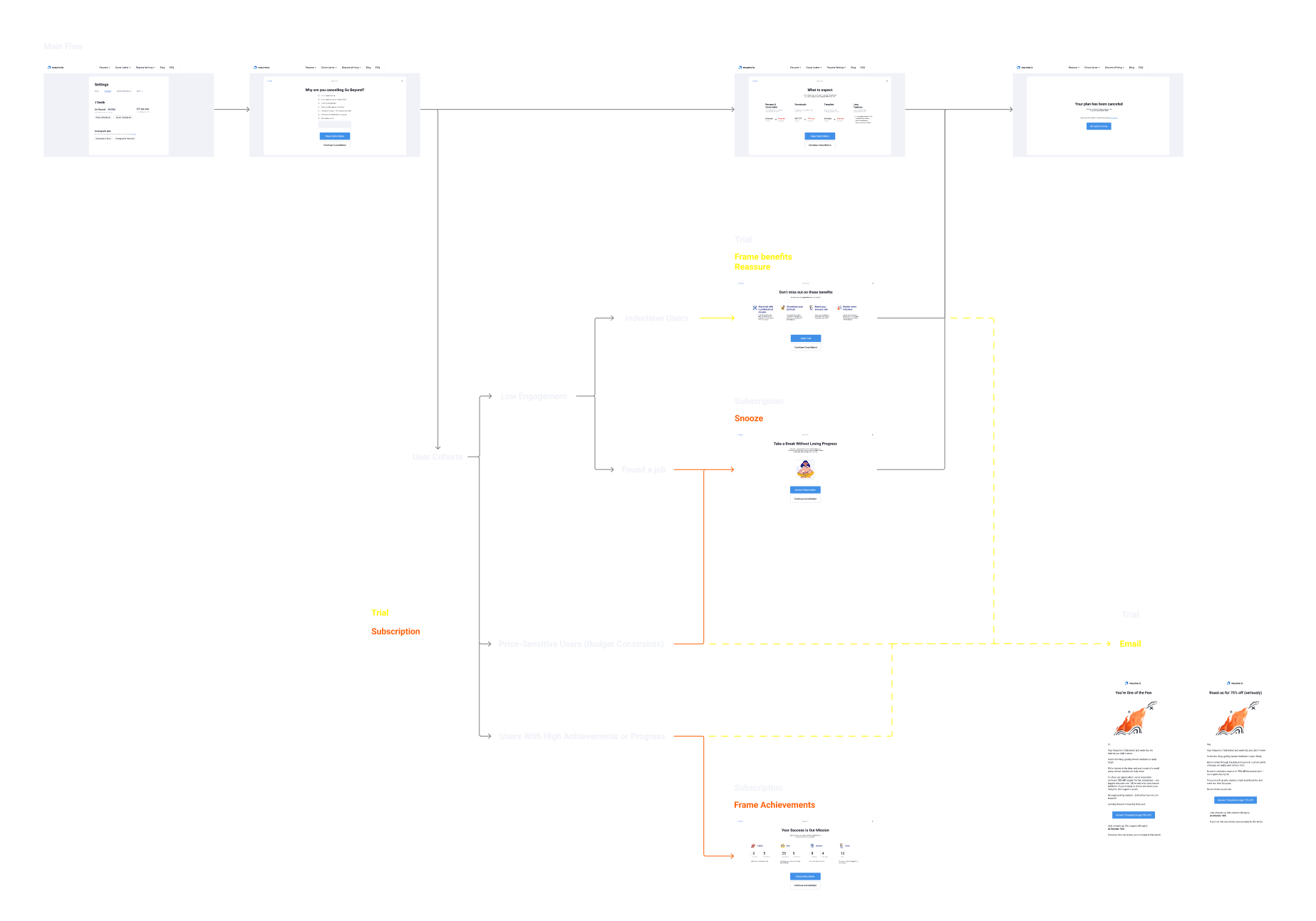
Revamped offboarding flow & scenarios
I designed a step-by-step flow that offers different options or messages depending on the user’s reason for unsubscribing.
Unlike the original flow, the updated version assumes the main entry point is now located in the user’s profile. This means a revamped profile page is introduced, featuring subscription details and a clear cancellation option.
After clicking to cancel, the user proceeds to the first step—a short survey capturing reasons for cancellation.
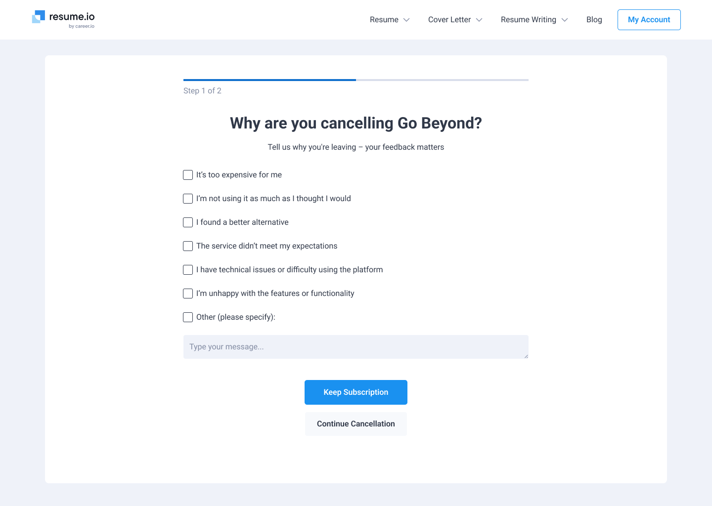
Based on the user’s metrics (e.g., level of activity, subscription history) and their survey response, one of the following scenarios is triggered:
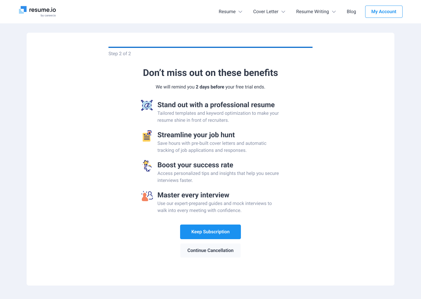
Scenario 1: Highlighting Losses
Aimed at the main user group, this step emphasizes what the user will lose by canceling—such as premium features or ongoing benefits. The goal is to leverage the psychological principle of loss aversion, underscoring the value of the subscription and making the decision to cancel more difficult.
Aimed at the main user group, this step emphasizes what the user will lose by canceling—such as premium features or ongoing benefits. The goal is to leverage the psychological principle of loss aversion, underscoring the value of the subscription and making the decision to cancel more difficult.

Scenario 2: Highlighting Features
Designed for indecisive users with low engagement, this version focuses on key features they might not have fully explored. It also clarifies the remaining trial period for those concerned about billing dates, encouraging them to discover more of the service before making a final decision.
Designed for indecisive users with low engagement, this version focuses on key features they might not have fully explored. It also clarifies the remaining trial period for those concerned about billing dates, encouraging them to discover more of the service before making a final decision.
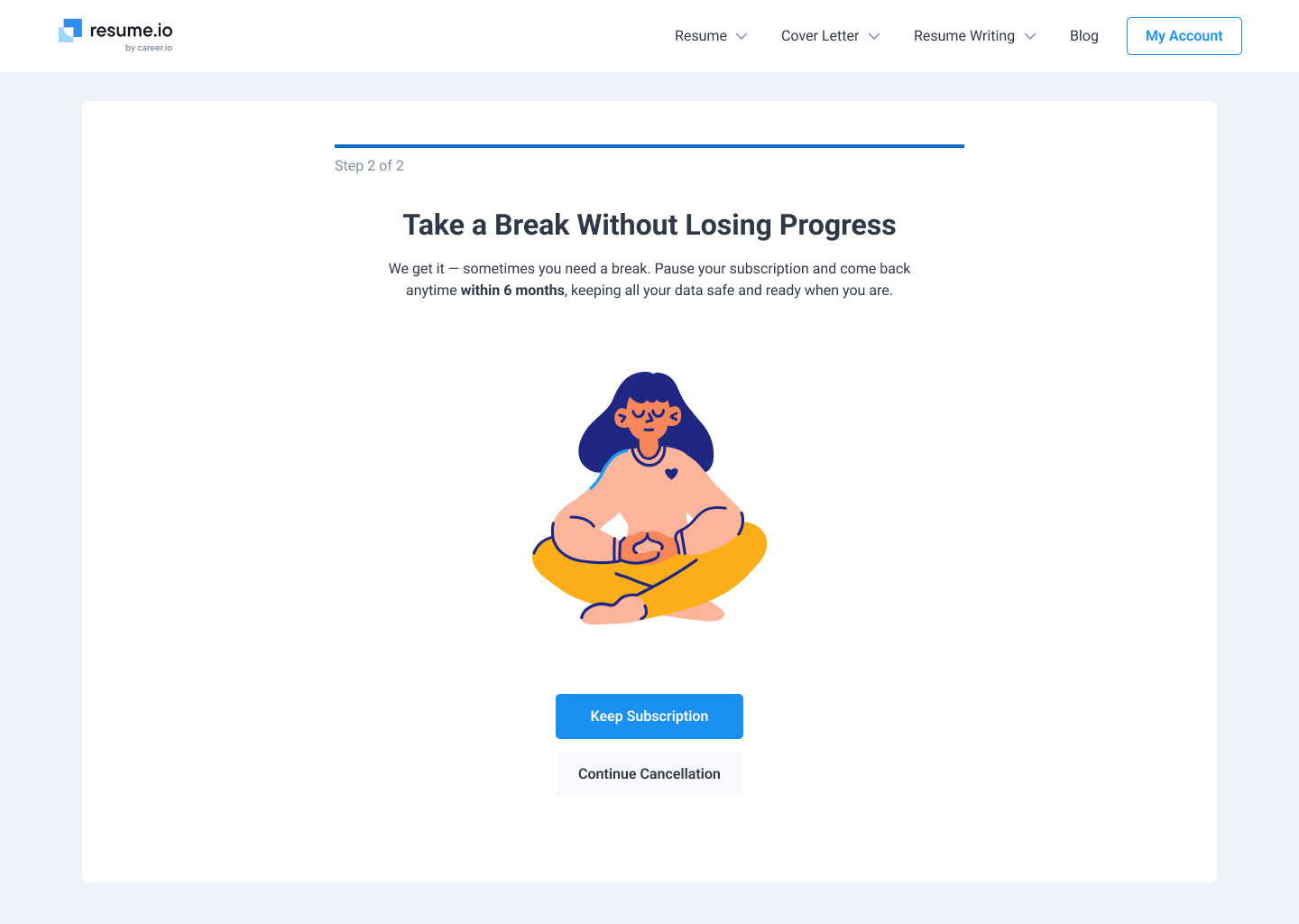
Scenario 3: A Proactive Option
Intended for low-engagement users who have found a job or who have financial constraints, this approach offers a practical solution that lets them achieve what they want — such as pausing or reducing their plan — while still maintaining a connection to the service.
Intended for low-engagement users who have found a job or who have financial constraints, this approach offers a practical solution that lets them achieve what they want — such as pausing or reducing their plan — while still maintaining a connection to the service.
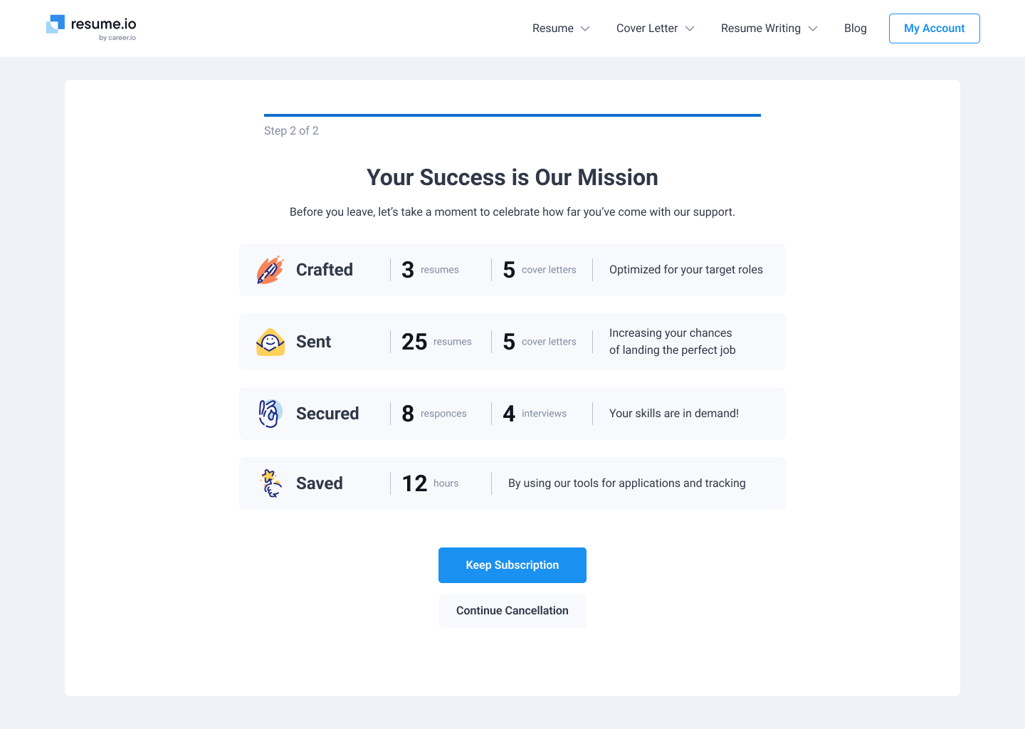
Scenario 4: Emphasizing Achievements
If the user has been highly active and already gained tangible benefits, the interface highlights their progress and potential future achievements. This scenario aims to motivate them to continue leveraging the service to reach even higher goals.
If the user has been highly active and already gained tangible benefits, the interface highlights their progress and potential future achievements. This scenario aims to motivate them to continue leveraging the service to reach even higher goals.

⠀
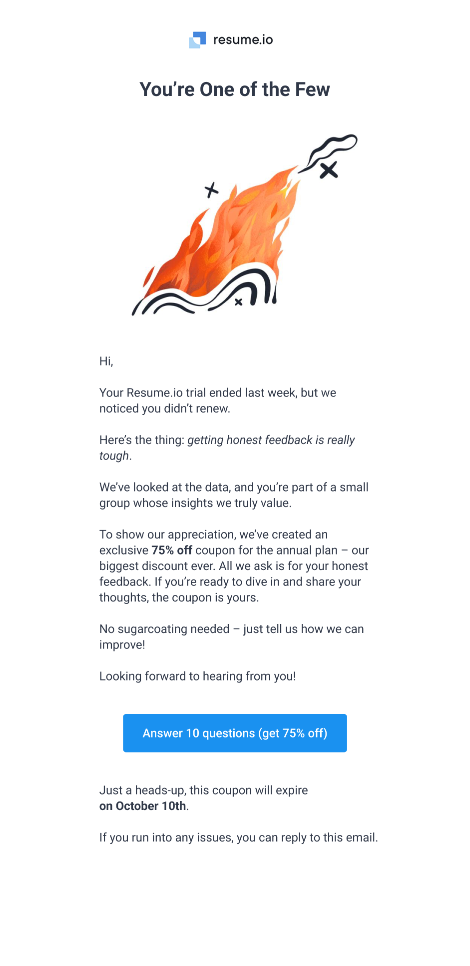
Crafting personalized email variants
Some users cancel their trial early, so I proposed sending a follow-up email whenever the trial is canceled or expires without renewal. This email suggests filling out a detailed survey in exchange for a discount, creating a mutual exchange instead of a one-way incentive. Two versions of the email — one casual, one more formal — address different user motivations.
⠀
Metrics to measure impact
By implementing this revised flow, we anticipate a modest increase in retention — 10–15% of users who would otherwise cancel entirely might opt for a pause or discounted plan.
We would measure:
● The percentage of users completing cancellation vs. opting for alternative offers
● The reasons for unsubscribing captured via the new form (qualitative data)
● Subsequent re-subscribe rates from cohorts who only paused
Validation & testing strategy
I would run A/B tests comparing the old and new unsubscribe experiences. If successful, the new design would fully replace the existing flow.
Conclusion and next steps
This case study shows how a well-thought-out process — from identifying user motivations to designing targeted retention scenarios — can positively influence business outcomes. Even without live data, the approach itself is versatile.
I applied UX research methods, user flow mapping, and iterative design to propose a more personalized unsubscribe experience. In a real-world environment, ongoing analytics and user feedback would be critical in refining each step.
Thanks for taking a peek!
Other Projects